
GPT-Image 2.5 MasterCourse
Create campaign-ready visuals without guessing
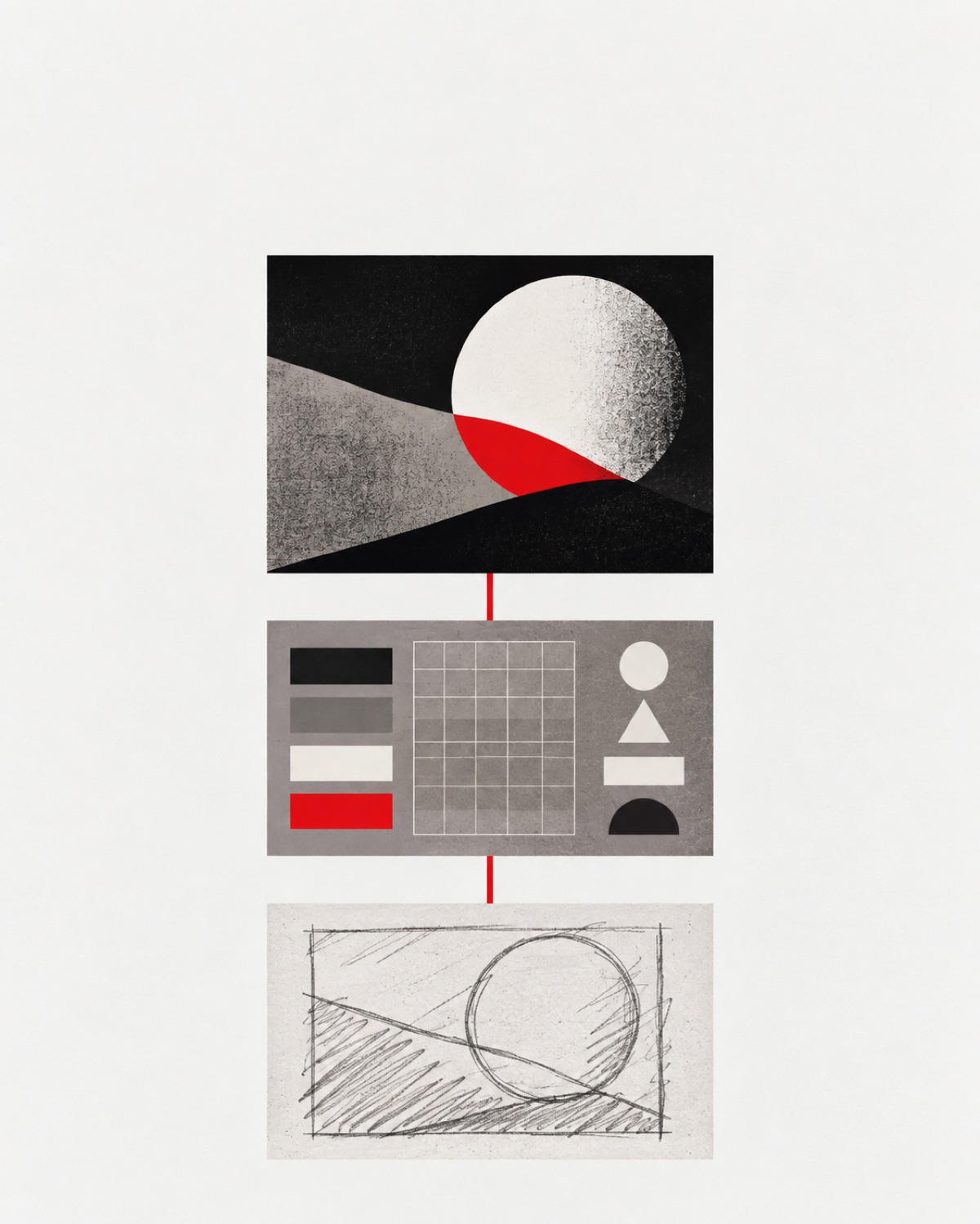
Most image prompting advice gives you a giant paragraph and a beautiful result.
It rarely tells you which decisions mattered, what the model ignored, or how to repair the image when it misses.
This mini-course gives you a different system. You will learn a 10-step workflow for directing, checking, and repairing GPT-Image 2.5 outputs. It includes three original AI Topia examples, the prompts used to create them, and a reusable master template.
The goal is not to memorize magic words. The goal is to make every important visual decision observable.
1. Start with the job
Before describing colors, cameras, or materials, decide what the image must accomplish.
Use the JOB framework:
- Journey: Where will someone see the image?
- Outcome: What should they understand, feel, or do?
- Boundary: What would make the result unusable?
A YouTube thumbnail needs instant clarity at phone size. A product image needs believable materials and an unmistakable hero. A landing-page visual needs space for copy and a clear relationship to the offer.
“Make it premium” is not a job. “Make one black recorder feel precise, quiet, and trustworthy on a product page” is.
2. Build the visible brief
Write your prompt in six layers:
- Purpose: intended use and desired response
- Canvas: aspect ratio and crop
- Contents: exact subjects, objects, and words
- Relationships: placement, scale, overlap, and order
- Appearance: lighting, materials, palette, and finish
- Checks: counts, spelling, exclusions, and protected details
Every sentence should create a visible decision or protect one.
Weak: “A luxury AI device on a beautiful background.”
Strong: “Exactly one compact matte-black recorder on off-white paper, with a red circular button, brushed-metal edge, and one soft contact shadow.”
3. Design the hierarchy before the decoration
Complex images fail when every object competes for attention.
Define the reading order first:
- What gets noticed first?
- What proves the promise?
- What supports the subject?
- Where should the eye stop?
For the lead-magnet cover, the hierarchy is simple: rough visual brief, structured prompt, finished image. One red line shows progression. The finished frame has the strongest contrast because it is the payoff.
What worked: The three-stage workflow reads clearly. The strict black, off-white, gray, and red palette feels like one coherent editorial system.
What shifted: The cover uses a light ground instead of the usual dark AI Topia cover. The restraint and clarity make that tradeoff useful for this educational asset.
4. Give every reference one job
Do not tell the model to “use these references” and hope it understands.
Assign each image a role:
- Identity: who or what must remain recognizable
- Layout: where elements belong
- Material: what surfaces should feel like
- Lighting: direction, softness, and contrast
- Palette: which colors carry into the result
If two references disagree, resolve the conflict in the prompt. A layout reference should not silently replace the identity source.
5. Use identity references without copying the source scene

For this example, Mina’s portrait controlled identity only. The studio, wardrobe, pose, desk, and campaign prints were newly directed.
Prompt used
Use the attached original Mina portrait only as the exact identity reference. Create a sophisticated editorial portrait of the same adult woman as an AI creative director reviewing one large contact sheet at a minimal black desk. Preserve her recognizable face, long dark-brown hair, natural skin texture, and calm expression. Use a cool neutral-gray studio wall, matte near-black desk, and one off-white contact sheet with grayscale images and restrained red blocks. Frame vertically at 4:5, waist-up, with Mina slightly right of center and negative space at upper left. Use neutral daylight from image-left with no amber cast. Dress her in a structured black top. Keep the visible hand anatomically natural. No readable text, logos, watermark, extra people, warm décor, orange, gold, blue, purple, or clutter.
What worked: Mina remains recognizable. The cool gray, black, off-white, and red system feels cleaner and more intentional.
What shifted: Her pose and hand position changed from the source. That is expected because the reference controlled identity, not composition.
The lesson: state what the reference controls and what the model is free to invent.
6. Make “premium” measurable
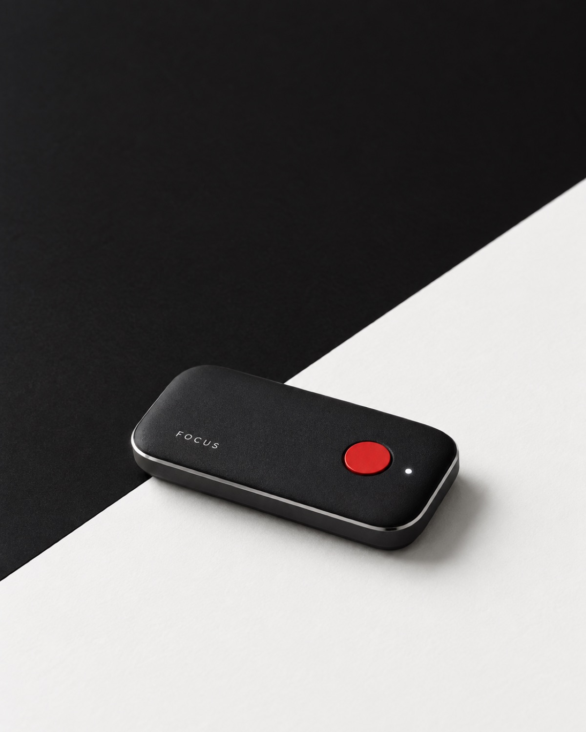
Abstract adjectives are hard to inspect. Translate them into physical evidence.
For the fictional FOCUS recorder, “premium” became:
- Matte black polymer with visible microtexture
- A narrow brushed-metal edge
- One precise red button
- A grounded contact shadow
- One crisp product name
- Generous negative space
Prompt used
Create a rigorous Swiss-style product photograph for a fictional compact AI voice recorder named FOCUS. Show exactly one low matte-black device with softly rounded rectangular geometry, one red circular record button, one tiny white status light, and a thin cool-silver edge. Rest it flat at a slight three-quarter angle on a sharply divided black and cool off-white paper field. Portrait 4:5. Keep the product in the lower center at about 30 percent of the canvas height with generous negative space. Use a cool neutral softbox from upper left, precise edge definition, and one short contact shadow. Render “FOCUS” exactly once in small crisp off-white lettering. Use only near-black, off-white, gray, cool silver, and red. No orange, beige, brown, bronze, gold, blue, purple, gradients, hands, cables, microphones, phones, fake UI, extra controls, logos, or watermark.
What worked: The name is correct, the object count is correct, and polymer, metal, paper, and light remain distinct.
What shifted: The status light renders brighter than a physical low-power indicator probably would. The core proportion, hierarchy, and palette pass.
7. Repair the smallest visible failure
Do not rewrite the entire prompt when one element is wrong.
Use CHANGE:
- Change: Name the exact correction.
- Hold: Protect everything already working.
- Allow: Permit physically necessary consequences.
Example repair:
Make only the recorder body 15 percent shorter while preserving its width, corner radius, red button, orange light, FOCUS lettering, camera angle, paper platform, crop, and lighting. Allow the contact shadow and metal-edge reflection to adjust naturally. Change nothing else.
Always repair from the best accepted image, not from the most recent failed edit.
8. The layer most operators skip
Most people judge an image with one question: “Does it look good?”
That is too vague.
Run the IMAGE check:
- Inventory: Are all required objects present in the right count?
- Message: Is the promise clear at the intended viewing size?
- Accuracy: Are words, labels, relationships, and identity correct?
- Geometry: Are hands, products, perspective, and contact believable?
- Exclusions: Did anything forbidden appear?
Mark each requirement pass, fail, uncertain, or not evaluated. Separate objective errors from aesthetic preferences.
9. What stays human
Do not automate the final judgment.
Humans still need to decide:
- Whether the image fits the campaign strategy
- Whether the identity feels respectful and accurate
- Whether the visual promise matches the actual offer
- Whether small errors could damage trust
- Whether the result is distinctive enough to publish
AI can generate and inspect candidates. You remain responsible for taste, truth, and the final yes.
10. Copy-and-paste master workflow
Use this before every generation:
Identify whether this is a new image, remix, reconstruction, or local edit.

Define the purpose, canvas, required subjects, exact words, relationships, appearance, and nonnegotiable checks.

For every attached image, assign one role: identity, layout, material, lighting, or palette. State what to ignore. Resolve conflicts between references.

Translate quality words into visible choices about composition, material, light, typography, and finish. Remove instructions that contradict each other.

Generate one candidate. Record the exact prompt and input order.

Inspect inventory, message, accuracy, geometry, and exclusions. Report pass, fail, uncertain, or not evaluated with visible evidence.

Repair the most important diagnosed failure from the best accepted source. Use Change, Hold, Allow. Reject edits that introduce larger regressions.

Return the final image, exact prompt, inputs, checks, and remaining limitations.
You do not need a longer prompt. You need clearer decisions and a better review loop.
Want this set up for your business?
We turn these workflows into working marketing and sales systems.